ShopDreamUp AI ArtDreamUp
Deviation Actions


Suggested Deviants


Suggested Collections


You Might Like…


Featured in Groups


Comments30
Join the community to add your comment. Already a deviant? Log In
The YounGester Again part of #FeedbackFrenzy project.
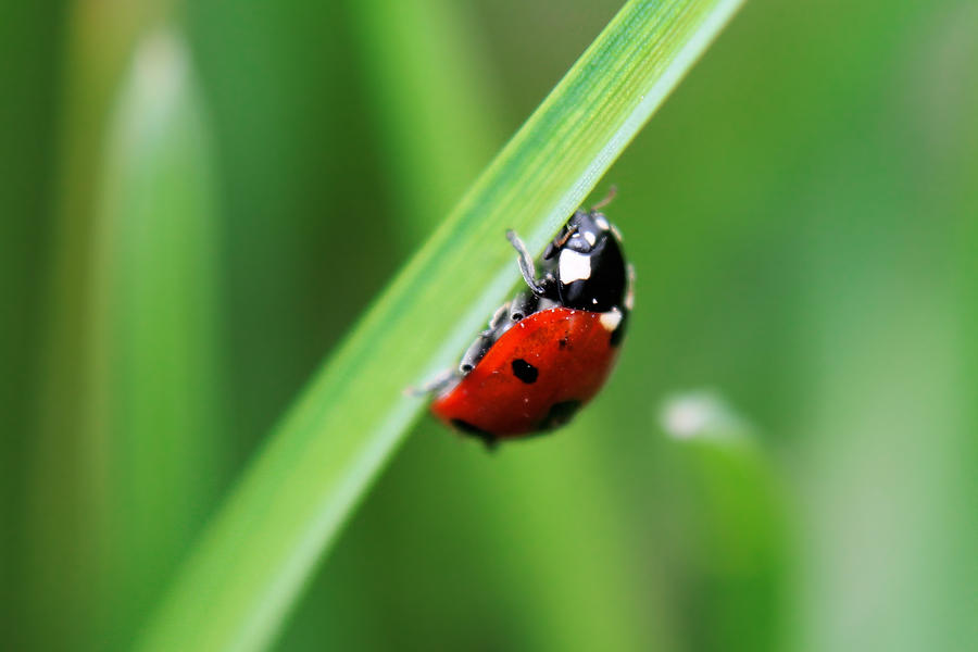
I like this picture and the ambient and the ladybug, the pallete of the colours, the way you made them look is great, they are so balanced and wisely used. Because of that the Ladybug is always the foucs of the pic and with the little blurry connects with the background making it look like a hole.
But after looking it for a while, maybe is a little bit too blurry (The background) I susggest a little less.
The angle of the pic is good, helps to the composition.
I have to say that the right part of the ladybug with the blurry is not eye-friendly, is good, dont get me wrong but I sort of prefer it without it because is too much blur.
However is a good pic, keept doing it this good. Hope this help even a little bit.